Pantone’s 2016 Colors Of The Year Are Very Serene
one is literally named “serenity”
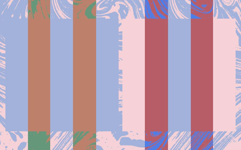
If last year's Pantone Color of the Year, or possibly our acute coverage of it, disturbed you, don't fret—things are about to get a lot better. Yesterday, Pantone revealed that they chose Pantone 15-3919 Serenity, a cool blue, and Pantone 13-1520 Rose Quartz, a warm, pale pink, as next year's colors of the year. Intended to reflect the present-day desire to relieve stress and promote wellness, the hues also embody society's shift toward gender fluidity.
"In many parts of the world we are experiencing a gender blur as it relates to fashion, which has in turn impacted color trends throughout all other areas of design," Leatrice Eiseman, executive director of the Pantone Color Institute, said in a release. She continued, "This more unilateral approach to color is coinciding with societal movements toward gender equality and fluidity, the consumers’ increased comfort with using color as a form of expression, which includes a generation that has less concern about being typecast or judged, and an open exchange of digital information that has opened our eyes to different approaches to color usage."
Like most things that challenge traditional ideals and practices, this decision hasn't been without controversy and has received a large share of pushback and criticism. Internet commenters are questioning the fact that the color and design company is taking what they consider to be a "political" stance.
"An expression of a mood and an attitude," we've already seen the colors on a bevy of recent runways, like Prada, Fendi, Thom Browne, Chanel, and Valentino. Given that Pantone's Color of the Year is the fashion, beauty, and homegoods' most impactful color trends predictor, it's safe to say that you'll be seeing a lot of these colors. So, get ready to find some inner peace and solitude at every mall across America.

photo courtesy of pantone
