Entertainment
Here’s The Story Behind That Instantly Iconic ‘Proud Mary’ Poster
A new classic is born
Here's a pitch for you: Taraji P. Henson as a hitwoman. That in and of itself is enough to green-light a project. Tack on the fact that she's not just any old hitwoman but a strong, empowered woman, inspired by iconic Blaxploitation characters, like the ones Pam Grier made famous, and you've got a movie like this month's Proud Mary.
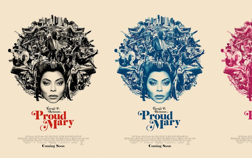
The excitement for the movie was near-deafening from the moment the trailer dropped back in July. Hollywood was finally putting good money behind a strong black female character dishing out justice and revenge in ways male characters have done in the past. The poster art that was released soon after helped drive that message home. With L Associates' Brian Christensen and Truc Le overseeing the campaign as creative and art director, respectively, Proud Mary quickly established itself as a forward-thinking hitman story rooted in the likes of Jackie Brown and Coffy. The poster art wears its nostalgic element on its sleeve while Henson's arresting stare outward carries an element of dangerous seduction. Henson's Mary is a modern classic, thanks in part to L Associates' art.
I caught up with both Christensen and Le to see just how referential they were in their work and why it works so well as both promotional and covetable material.
What is the first thing you and your team do when presented with a project?
Panic. Ha. Kidding. We first absorb all the materials we’re provided—whether that’s a script, early screener, unit photography, concept art, special photo shoot, etc.—and take stock of the assets. We meticulously research the property and genre—in this case, female-driven action thriller—and see what’s been done and where there’s an opportunity to break new ground. We kick off with the full creative team and start pulling visual reference and inspiration. Nobody is censored. Nothing is off-limits.
How would you describe your design ethos?
Our design ethos is that we don’t have one. To inject a specific POV into all of our projects would do each a disservice; they’re each unique opportunities that require different aesthetic approaches. We do always try to create something totally new that hasn’t been seen before. That’s a very nebulous, though helpful, guiding light for all of our artists on every project.
What is the L Associates magic touch?
Creative freedom. We pride ourselves in a lack of hierarchy or bureaucracy. It’s cliché, but a good idea really can come from anywhere. Account execs, copywriters, junior art directors are all encouraged to pitch visuals. There’s no red tape. No rigid caste system of traditional agencies. We think of ourselves as a diverse group of creatives.
Were there any must-haves and absolute no-nos the Proud Mary team requested?
Our client at Sony, Damon Wolf, gave us an incredible amount of creative freedom on this project. He challenged us simply to do something really amazing: a work of art, rather than a piece of movie marketing. Basically, he said, “Do something so cool that I have to print it.” It was liberating to have that kind of free creative rein. Often movie marketing can be reactionary: "This film did well, so let’s borrow their approach.” Damon encouraged us to be totally fresh. Set the trend, rather than follow it. From the beginning, it was also imperative that the art reflect the film’s message of female empowerment. It needed to be confident and badass. Truc Le, as a female art director, is proud to have designed such a strong, yet still feminine, piece.
It's evident Blaxploitation films and the art that surrounds them were a major influence here, along with hints of 007. What other influences may not be as apparent to the casual observer?
Music, particularly Parliament-Funkadelic album covers and '70s soul played a big influence.
I love how contemporary the poster art for Proud Mary feels and, at the same time, appreciate it for its nostalgia—what about this particular campaign feels right for the current cultural climate?
In a lot of Blaxploitation films, like Shaft, women are treated as objects. We looked at films like Coffy where the tables are turned and women are dishing out justice and revenge. The piece is definitely meant to be empowering to women. Taraji stares daggers directly at the viewer, not flinching, not backing down. In the news, we’re constantly reminded that racism and sexism are very much alive today, as much as we’d like to think we’re past them. One way to combat those evils is to be proud of who you are, where you come from. Proud Mary’s character—and the artwork for the film—embodies that pride.
More and more importance is being placed movie posters. Everything from The Beguiled's poster to Thor: Ragnarok, Get Out,mother!, and Raw [editor's note: Many of these posters L Associates worked on] all feel like works of art worthy of framing. Is this indicative of a shift in cinema?
We can suggest a couple reasons for the renaissance in movie poster art. Part of it is a reaction to the "big floating heads in the sky" trend that dominated posters for several decades. Part of it is that audiences are tired of being spoken down to. They can see through shortcuts and tropes. Creating thoughtful, memorable art that resonates with people really gets them invested in the film’s story and success. Also, there are more and more avenues for disseminating marketing content: Twitter, Facebook, Instagram, living one-sheets on web banners, etc. Posters aren’t just seen in theaters. Rather than a singular piece of key art, a movie can now have 10, 20, 30 pieces of designed content. Now, something maybe less "commercial" and more envelope-pushing that was developed with a different platform in mind can be seen by clients who realize its brilliance and make it the key art. Another possible explanation: The market is so flooded with streaming content that to make a property stand out, you have to create art that is memorable and unique.
