Entertainment
artist in residence: david marsh
magic eye masterpieces for the music set.
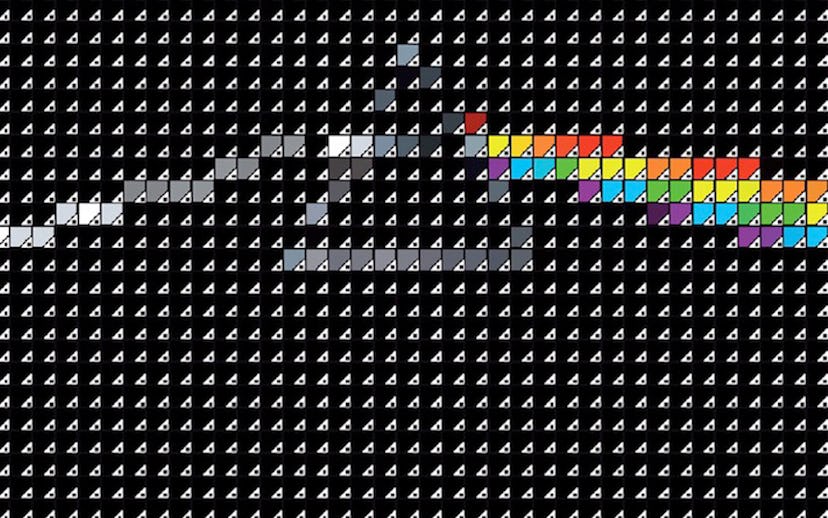
There's no shortage of people who've been inspired by Pink Floyd's 1973 iconic record The Dark Side of the Moon, or Patti Smith's 1975 debut Horses. David Marsh is one of them. But unlike the rest of us who simply memorize the lyrics, the British graphic designer has taken his fandom one step further by transforming these discs into a whole new kind of art.
In his 2012 Pantone series, Marsh re-imagines classic album art using Pantone colors and Adobe Illustrator software. He combines the two to morph thousands of teeny computer-generated squares into pixelated versions of Nirvana's Nevermind, Johnny Cash's At Folsom Prison, and more.
According to the artist, "my work really is about the content or subject being revealed, hidden if you like, in an abstract grid of coloured squares that, when viewed up close initially have no relationship with one another. It is only when you retire from the work that your mind takes over and the optical illusion triggers your conscious and recognition occurs." Just like those old-school Magic Eye games, the resulting print might look blurry at first, but once you step back, you totally get it. Think of his prints as the message beyond the music message that's already blasting from your stereo.
Given his expertise, it should go without saying that Marsh has an awesome in-studio playlist; he says he's currently into bands like LCD Soundsystem, Aphex Twin, Django Django, and The Clash. But his ultimate muse? That would be Bjork. "She's creative, intelligent, abstract, avant garde, slightly mad, funny and proud of her heritage," he explains. "I'd like a beer with Bjork." Um, can we come?
See our favorite David Marsh works below and learn more about him here.